Click Chiropractic
A consumer-facing health clinic website designed for users to explore available services and schedule appointments.

Overview
Click Chiropractic, a family chiropractic clinic serving a diverse demographic, enlisted our expertise to conduct user testing and design the website to effectively showcase their services and information.

Problem
Our challenge was to design an attractive and user-friendly website from scratch that met the client’s requirements while effectively showcasing their services.
Solution
Crafted a visually captivating and intuitive website, perfectly aligning with the client's needs and showcasing their services effectively.
My Role
UI Designer & Prototyper

Duration
10 weeks

Tools
Figma

Slack

Google Docs

Google Sheets

Kick-off
Our team held a kick-off meeting to launch the Click Chiropractic website design project. The goal was to create an attractive, user-friendly website from scratch that effectively showcased their services.
Meeting Highlights:
Project Overview:
Dr. Azodi outlined the vision for a modern, intuitive website.
Stakeholder Alignment:Identified key stakeholders and set up communication channels.
Research and Discovery:Reviewed user research findings and client materials.Project
Scope and Timeline:Defined scope, deliverables, and milestones.
Roles and Responsibilities:Assigned team roles and clarified responsibilities.
Initial Design Concepts:Presented initial designs and gathered feedback.
Next Steps:Developed a user test plan and scheduled regular check-ins.
Research
As my role was UI designer and prototyper, I focused on the visual aspects of the project. I conducted research to gather insights, exploring websites similar to Chick Chiropractic to ensure the design would feel familiar and universally applicable to users of such services.


Design System
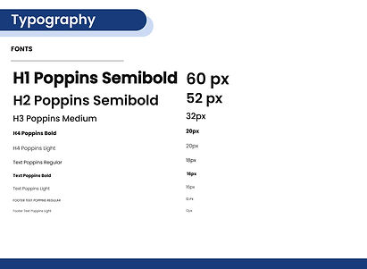
As a UI designer, I led the development of a robust design system aimed at promoting consistency and efficiency throughout our projects. Using Figma, I meticulously crafted a comprehensive design system that includes cohesive color palettes, typography guidelines, spacing rules, and a library of reusable components. This system not only ensured a unified visual identity but also streamlined our design process, enabling faster iteration and implementation. By integrating user feedback and iterative improvements, I successfully established a scalable framework that empowered our team to deliver cohesive and user-centered designs.


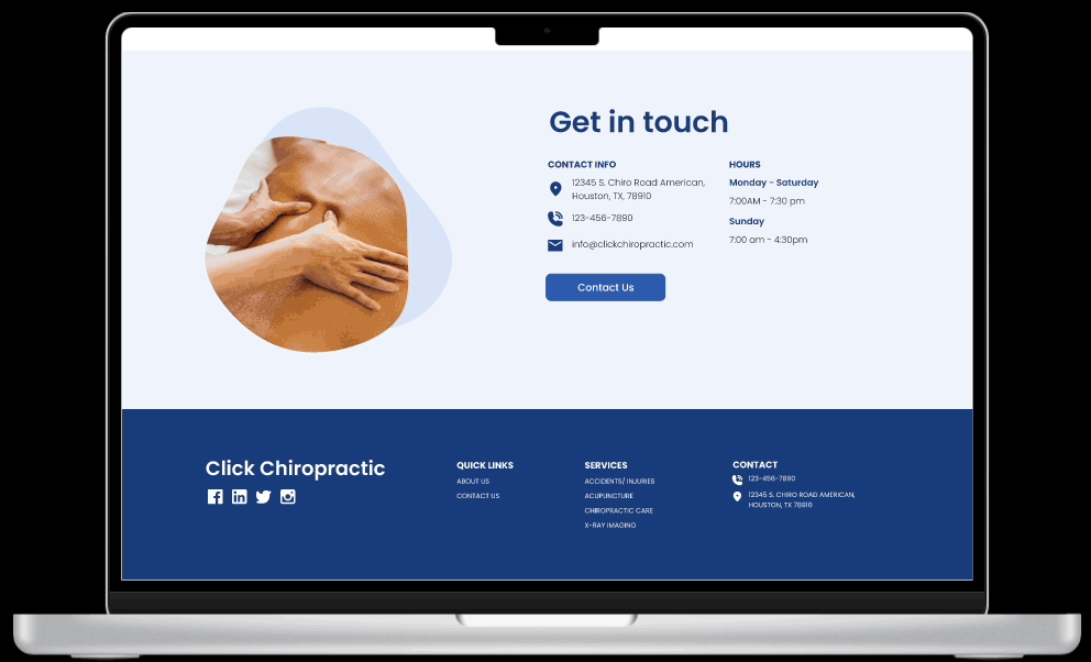
Hi-Fidelity Screens
I collaborated with fellow designers to implement color and layout updates on-screen, adhering closely to our established design system. This involved refining the color palette and ensuring consistency across all elements. By leveraging our design system, we achieved a cohesive look and feel that enhanced user experience and maintained brand identity


Prototype
After completing the high-fidelity screens, I developed the prototype for interaction and conducted usability testing. This process ensured that our designs not only looked polished but also functioned intuitively, meeting user needs effectively.

Usability Testing
We conducted unmoderated testing with 15 users via UserTesting.com based on our test plan. While all users liked the website's aesthetics and found tasks easy to complete, minor usability issues emerged:
-
15% found services unclear
-
6% noted unclear CTA button copy
-
13% found team information vague
-
10% felt page content was too large
Following our report, we redesigned screens to address these issues.
Hi-Fi Iterations
After user testing, we updated the hi-fi screens based on findings. I focused on user flow 3, particularly on the services tab, collaborating with a teammate. I applied style presets to text elements and adjusted leading, rag, and baseline alignment for readability and consistency.
The issues addressed included:
-
Inappropriate images (Solution: Updated to relevant ones)
-
Confusing CTA buttons (Solution: Used consistent copy)
-
Excessive white space (Solution: Reduced spacing)
-
Oversized hero image (Solution: Decreased size)
-
Lack of upfront location details (Solution: Added dismissable banner)
Developer Handoff

Reflection
Click Chiropractic was a valuable learning experience, emphasizing the significance of usability testing in design. Despite initial impressions of the designs, I realized every identified error presents an opportunity for improvement.
The main challenge was adopting a researcher mindset to devise metrics for an effective test plan. Collaborating with the team, I strategized on targeting key questions and ensuring user-centricity in the script.
Given more time, I would further refine our re-designs and conduct additional testing to assess improvements and explore further enhancements.