Blueprint Design System
The Blueprint Design System is flexible and scalable, with customizable fonts, colors, and styles to fit any brand. It features a comprehensive component library; buttons, inputs, badges, chips, alerts, and more; and is fully extensible, allowing users to add new components as needed.

What Is a Design System?
A design system is a collection of reusable components, patterns, and guidelines that help teams build consistent and scalable digital products. It bridges the gap between design and development by creating a shared visual language and improving collaboration.


Why a Design System Is Needed?
As products grow, design inconsistencies and inefficiencies often appear. A design system streamlines workflows, ensures accessibility, and speeds up delivery; allowing teams to focus on solving user problems rather than redesigning common elements.
Atomic Design
Atomic Design is a methodology created by Brad Frost that structures user interface components into five distinct levels; Atoms, Molecules, Organisms, Templates, and Pages. This approach helps teams build scalable systems with clarity and consistency.

Atoms
The smallest building blocks in our system. In design we have buttons, inputs, and labels.

Molecules
A combination of multiple atoms. Each atom has carried its unique properties into a group that has its own distinct characteristics. (e.g., an Input field + Label + Button)

Organisms
Collections of atoms and molecules that become more complex than the molecular level. (e.g., a full Card or a Navigation Sidebar)
A Few Examples of Components
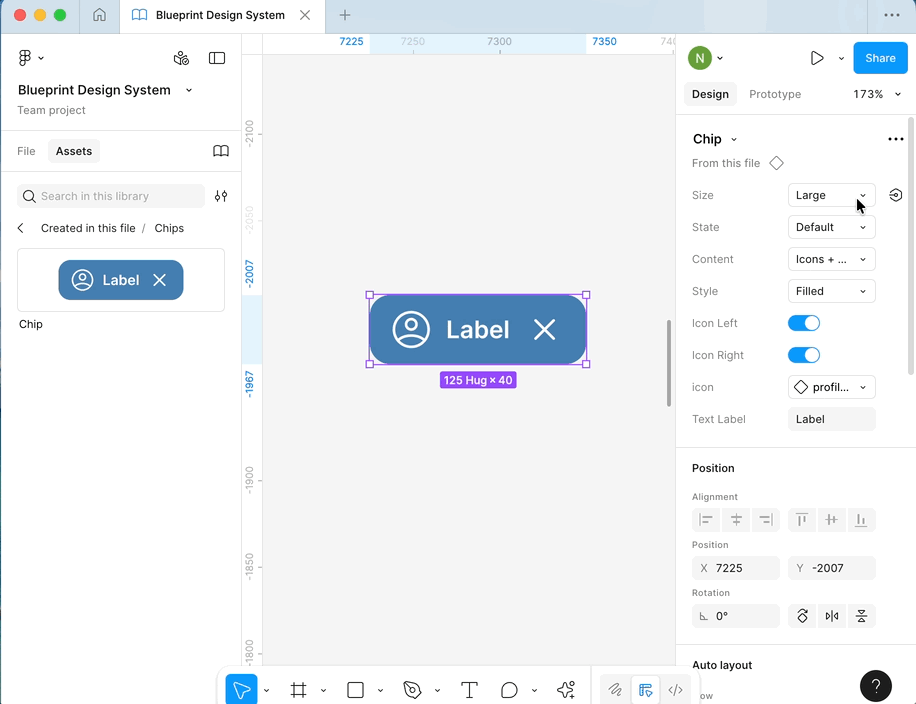
Smart Chips Component
A fully scalable chips component (99 Variants) built using Figma’s Component Properties; variants, toggles, and instance swaps; to enable quick customization from a single source. Designers can adjust size, state, icons, and style instantly while maintaining consistency across the system.

Adaptive Card Component
A versatile card component built with Figma’s Component Properties, allowing designers to switch between outlined, elevated, and filled styles effortlessly. Options to toggle subtitles and button layouts make it adaptable for a wide range of use cases.
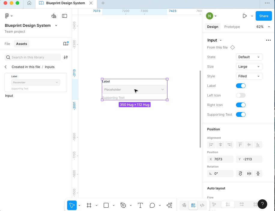
Flexible Input Components
This demo highlights how I designed adaptable input components in Figma, allowing quick adjustments to labels, icons, and helper text while maintaining a consistent, scalable structure.
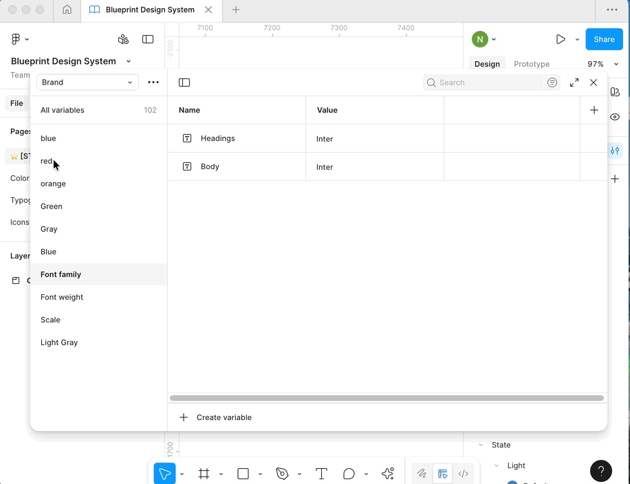
Design Tokens with Variables
Design tokens are defined and organized in Figma’s Variables panel within collections such as Brand, Alias, Mapped, and Responsive; enabling scalable, system-wide updates and consistent design across projects.
Explore the Full Design System
The Blueprint Design System was built in Figma using Auto Layout, variables, and component properties to ensure scalability and consistency. It includes complete foundations; color, typography, spacing, and icons; along with reusable components structured with the Atomic Design approach.You can explore the full library and documentation directly in Figma to see how components, styles, and guidelines come together to create a cohesive design system.
I designed every component, built the token system, and documented usage guidelines.