Truelink
Mobile app designed to assist newcomers in making friends in their new city by simplifying the process of connecting with locals who share similar interests and hobbies.
Overview
Navigating the challenge of making friends in a new city, especially when not frequently socializing, is a common struggle. Establishing meaningful human connections is crucial for our well-being, yet finding individuals with shared interests can be daunting. Truelink streamlines the process of connecting with the local community and forging new friendships.
Problem
Making friends in a new city presents significant hurdles. Whether due to a limited social circle or unfamiliarity with the area, discovering like-minded individuals can prove difficult. Additionally, maintaining friendships, particularly those spanning distances, poses its own set of challenges.
Solution
Addressing the challenge of making friends in a new city and state requires innovative solutions. Individuals, whether possessing a small social network or freshly relocated, encounter obstacles in finding companions with similar interests or passions. Truelink streamlines this process, facilitating connections and fostering new friendships while also assisting in maintaining existing ones, even across long distances.
Role
Sole UX/UI Designer
Duration
8 weeks
Tools
Figma, FigJam, Miro,Google Workspace
Process
Research, Surveys & interviews, Ideation, Sketching, WireframingDesign, Prototype, Usability Testing, Results. Synthesis & Redesign

Secondary Research
Secondary research, conducted from blogs and online websites, uncovered several factors that make forming new friendships after relocating difficult. These include limited time for socializing, uncertainty about the qualities they seek in friends, and discomfort with using friendship apps. As a result, many adults tend to avoid actively pursuing new friendships.
Primary Research
Based on prior research, a research plan was developed to identify challenges individuals face when forming new connections. Demographic information was gathered, followed by distribution of a screener survey to recruit interviewees. Research methods comprised online surveys, with a 3-question survey posted on social media yielding 12 responses, and remote interviews conducted with 5 selected participants via Zoom. Data collected was subsequently synthesized using affinity mapping, empathy mapping, personas, and user stories.
Survey
The screener survey questions were crafted to pinpoint participants affected by the research topic for interviews. They screened for individuals within the appropriate age range, open to meeting new people post-relocation, and identified their primary relocation challenges.
Interviews
The 5 participants were questioned to discern crucial aspects for a deeper understanding of the issue. It emerged that all participants found it challenging to make new friends after relocating, revealing their current methods of meeting people, main struggles, attitudes toward digital tools, and approaches to initiating conversations with strangers.
Affinity Mapping
Affinity Mapping After gathering participant data, I better understood my potential users' challenges and needs, so I made an affinity map to organize and categorize the keynotes taken. The five categories were statements, current methods, views, and preferences.

Empathy Mapping
With empathy mapping, I was able to identify two types of users. Utilizing these tools allowed me to organize my research data and develop a proper understanding of the users' needs.


Personas
Using the empathy maps helped me create two personas and understand my users' pain points and goals, allowing me to design an app that addresses their needs. It also provided me with a visual representation of the users.


How Might We Statements (HMWs)
Crafted HMWs to ensure focused attention on user-shared problems uncovered during primary research. These HMWs aimed to prioritize the alleviation of consistent pain points, guiding efforts toward effective solutions.
-
How might we help individuals reduce stress during their first year of relocation?
-
How might we alleviate loneliness and facilitate connections with new people?
-
How might we support adaptation to a new city and state?
-
How might we facilitate the discovery of friends within similar age ranges and with shared interests?
-
How might we encourage users to maintain engagement in conversations with new acquaintances?

Ideation
Post HMW creation, solutions were sought for identified problems. Ideation involved jotting down helpful ideas and quick sketching to visualize potential solutions.

Site Map
A site map, built from user stories and gathered information, structured content, formed the app's foundation, and clarified page navigation and connections.

User Flows
This part of the project helped me visualize the user's journey through the app. I created three user flows of the essential tasks that needed to be completed. These user flows were critical to the app's main functions and enabled me to identify the elements that would be most valuable to the users.

Sketches
Sketching aided in visualizing the app's layout and mapping out its elements. It translated ideas onto paper, providing insight into potential design possibilities.


Wireframes
Mid-fidelity
Crafting wireframes in Figma refined layout and spacing, providing insights into prioritizing essential user features.


Mood Board
Brand Personality
Truelink is here to assist you to feel connected with your friends, family and your community. Find support and learn from one another.


Brand Attributes
Social, easy, excitement, fun, friendly


Design System
Crafted a brand style guide for visual consistency, defining color palette, fonts, UI elements, and iconography, with calming blue as the primary choice.


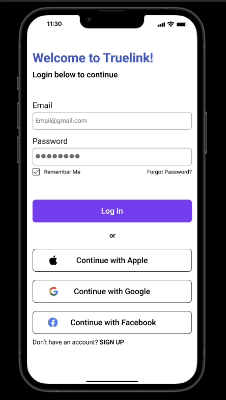
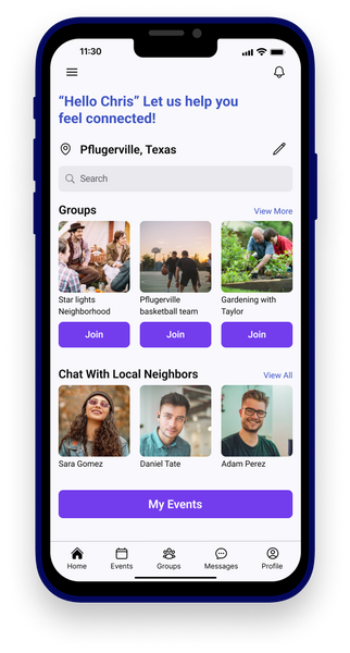
High- fidelity Screens
For High-Fi screens, emphasis was on creating a visually appealing, fun, and simple app. Multiple iterations were made to layout, text, and color choices to meet accessibility standards.


Prototype
Utilized Figma to prototype Truelink, making adjustments to ensure user-friendly features and showcasing envisioned design.

Usability Testing
Conducted five remote usability tests to evaluate app usability and identify areas for improvement. Tasks focused on sending a message, creating a new event, and joining a group. The goal was to ensure users could effectively complete these tasks and to uncover any pain points in user flows.

Test Results
Participants gave positive feedback on the app's navigation and aesthetics but highlighted some issues. Despite this, they could complete tasks quickly in the final prototype for an optimal user experience.
Issue #1
Users could not go to the group's screen from the home page.
Summary:
The groups on the home page, especially the "View More" option, was inactive.
Recommendations:
Added the interaction from "View More" on the homepage to the groups' screen.
Issue #2
The design of the messages screen needs to be more realistic.
Summary:
There was a need for a search bar on the messages screen to make it more realistic.
Recommendations:
search bar added on the top of the messages screen.
Issue #3
Users were not able to X out any group from the group page.
Summary:
There was no X out on any groups on the group page.
Recommendations:
X out added.
Redesign
Incorporating user feedback and brainstormed solutions, revisions were made to the high-fidelity wireframes. These changes enhanced user-friendliness and navigation within the app.

Reflection
This process underscored the significance of user research and usability testing. Early identification of major issues allowed for design improvements prior to development. Observing user interactions with the prototype provided valuable insights and feedback for enhancement. Additionally, user interest in the concept was noted, motivating further development. While initially a case study, I intend to advance the concept, designing the complete UI for remaining screens. Moving forward, my goal is to continue refining and developing the product, envisioning its realization as a tangible service in the future.