TechHive - Checkout Flow Redesign
Streamlining Enterprise Transactions


Project Overview
TechHive is a B2B SaaS platform for complex, multi-step enterprise purchases. Over time, the checkout flow lacked a unified UX strategy, leading to friction and drop-offs.
This project redesigned the checkout experience to be clearer, more efficient, and scalable; reducing cognitive load, simplifying decisions, and aligning with enterprise usability and business needs.


Problem
The current enterprise checkout flow is hindered by a fragmented, multi-page structure and unclear information hierarchy, resulting in high cognitive load and delayed error surfacing. This inefficiency directly contributes to increased friction, higher abandonment rates, and unnecessary dependence on support for transaction completion.


Solution
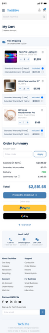
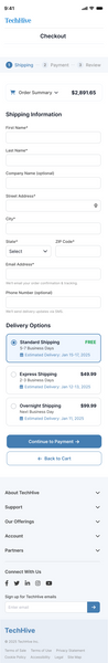
I led the redesign, transforming a fragmented flow into a predictable, three-step linear process (Shipping - Payment -Review).
This solution utilized systems thinking to drive contextual clarity, integrate inline validation for error reduction, and establish a scalable architecture.
The result is a highly efficient, low-friction checkout that directly reduces cognitive load and maximizes transaction success for enterprise users.
Design Process

UX Research & Methods Used

1)
Analytics Review
What I Analyzed
-
Checkout funnel drop-off points
-
Time spent per step
-
Error frequency during completion
Key Findings
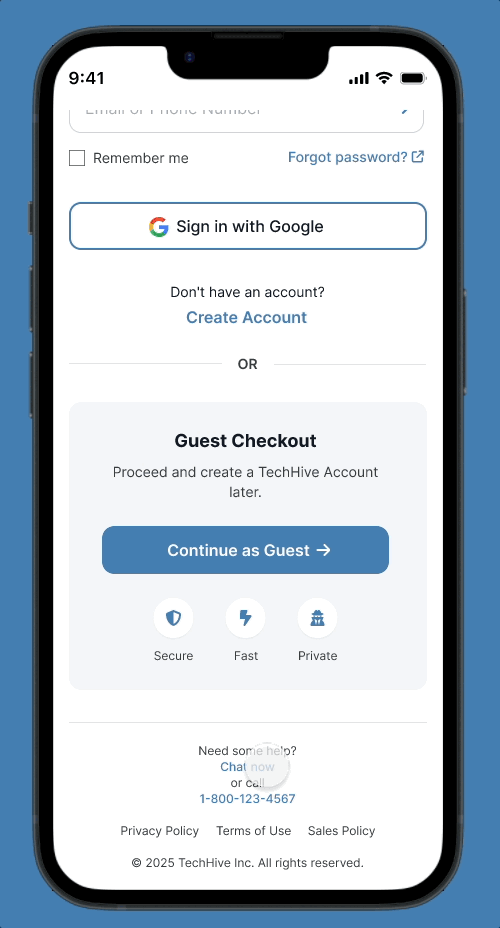
Drop-off at account creation → Users prefer guest checkout
Review step hesitation → Cost clarity missing earlier
Fewer errors with inline validation → Higher task success
2)
Heuristic Evaluation
I analyzed the TechHive checkout flow using Nielsen’s 10 Usability Heuristics to identify technical and psychological barriers to completion.
-
Primary Issue: Aesthetic and Minimalist Design. The shipping page was overly dense, leading to high cognitive load.
-
Secondary Issue: Consistency and Standards. Inconsistent CTA placements and form field groupings created confusion.
-
Key Takeaway: The findings revealed critical gaps in visual hierarchy and clarity, informing the decision to increase vertical spacing and simplify the form structure.
3)
User Interviews
Goal: To understand the frustrations users face when purchasing high-value electronics online.
Voice of the User:
"I just want to see the total price and when it's arriving without feeling overwhelmed by fields."
"I hate having to re-type my address for billing if it's the same as shipping."
"The 'Continue' button didn't stand out; I wasn't sure if I was done with the step."
"If I have a question about shipping, I don't want to leave the page and lose my progress."
Common Pain Points Identified:
-
Cognitive Overload: Too many fields grouped too closely together.
-
Friction: Lack of an "Address Auto-fill" or "Same as Billing" shortcut.
-
Weak Visual Hierarchy: Primary actions (CTAs) were not distinct enough from secondary actions.
-
Support Gap: No immediate way to get help without abandoning the cart.
4)
Competitive Analysis
I benchmarked TechHive against three major competitors: Amazon, Best Buy, and Apple. I focused on checkout speed, form density, mobile responsiveness, and support access.
-
Insights: Industry leaders prioritize "one-click" logic and minimal form fields.
-
Opportunity: While competitors offer speed, they often bury support. I identified an opportunity for TechHive to stand out by integrating a "Need Help" section directly into the checkout flow to reduce abandonment during complex tech purchases.
Define phase
Project Goals
-
Simplify multi-step checkout for enterprise buyers with a clear, linear flow
-
Reduce cognitive load by making totals, errors, and delivery info visible upfront
-
Enable fast, predictable transactions with express payment and auto-fill options
-
Ensure scalability and compliance, allowing future product expansions
Target Users
-
Enterprise buyers (25–55) responsible for multi-step purchasing decisions
-
Frequent users managing large or complex orders
-
Users needing predictable, fast checkout with minimal errors
-
Mobile-first users who value speed and efficiency
-
IT Managers

Design Execution
After completing research and clearly defining the goals, target users, and business requirements, I moved into creating low-fidelity wireframes to translate insights into a practical, task-focused flow.
These early designs were shared with stakeholders, product managers, and engineering to validate assumptions, ensure technical feasibility, and align on scope before moving forward.


Once the direction was validated, I leveraged the Blueprint Design System. a reusable, enterprise-ready system I previously Created.
The resulting designs demonstrate a scalable, consistent checkout experience aligned with both user needs and business objectives.
Desktop


Mobile

Interactive Prototype
To bring the final experience to life, I created clickable prototypes for desktop and mobile. These interactive flows helped stakeholders and users explore the redesigned checkout, evaluate usability, and align on the final direction.
Testing & Refinement
I tested the redesigned flows with users and stakeholders to assess task success, comprehension, and overall usability. The feedback guided several refinements; improving navigation clarity, reinforcing feedback states, and tightening the information hierarchy; resulting in a smoother, more intuitive checkout experience.
Developer Handoff
During handoff, I provided developers with annotated Figma flows, component-level documentation, and token-based specs from the Blueprint Design System. This ensured pixel-accuracy, consistent implementation, and a shared understanding of behavior, states, and responsive logic across the entire checkout experience.

Impact & Outcomes
Following the launch of the redesign, I utilized A/B testing and monitored user behavior via Google Analytics and Hotjar to measure success against our initial KPIs.

Final Reflection
The TechHive redesign proved that by prioritizing information hierarchy and reducing cognitive load, complex enterprise transactions can feel as intuitive as B2C shopping. By bridging the gap between user needs and technical feasibility, I delivered a solution that is both scalable for the business and effortless for the user.