Austin Regional Clinic's Website
Redesigning Austin Regional Clinic’s Website: A Modern, Patient-Centered Digital Experience


Project Overview
Austin Regional Clinic (ARC) serves thousands of patients across Central Texas, yet its digital experience doesn't reflect the same quality as its in-person care. This case study explores a comprehensive redesign of the ARC website and patient portal, aimed at making healthcare access simpler, faster, and more intuitive especially on mobile devices.

Problem
The Austin Regional Clinic (ARC) website faced usability challenges that made it difficult for patients to quickly access essential healthcare information. The site lacked clear navigation, modern design consistency, and accessibility features, which often caused frustration for users trying to find a doctor, schedule appointments, or locate a clinic near them. Patients needed a streamlined, mobile-friendly, and patient-focused experience that aligned with modern healthcare standards.
Solution
I redesigned the ARC website with a focus on clarity, accessibility, and patient-centered design. By creating a modern design system, improving navigation flow, and optimizing the site for desktop, tablet, and mobile, the new design helps patients easily book appointments, access services, and find clinic locations. The result is a user-friendly, consistent, and visually engaging platform that supports ARC’s mission to provide high-quality healthcare for the community.
Design Process
1

2

3

4

5

6

7

8

UX Research & Methods Used
-
Heuristic evaluation of current ARC website
-
Competitive analysis of regional healthcare providers
-
User interviews (5 participants)
-
Surveys on pain points and task success
1)
Heuristic Evaluation
Analyzed the ARC website using Nielsen’s heuristics to identify key usability issues affecting patient experience.

Key Takeaway
Findings revealed gaps in clarity, consistency, and control; informing redesign decisions for a smoother user journey.
2)
Competitive Analysis
Compared three regional providers. Baylor Scott & White, UT Health Austin, and CommUnityCare. Focusing on booking, provider search, portal access, mobile UX, accessibility, and design.

Key Takeaway
Baylor Scott & White and UT Health Austin delivered clear navigation and strong mobile/portal experiences, while CommUnityCare revealed gaps in accessibility and search. These insights shaped opportunities for ARC to stand out with streamlined booking, mobile-first design, and improved accessibility.
3)
User Interviews (5 participants)
Goal: Understand expectations, frustrations, and behaviors when booking care or accessing health info online.

Key Quotes:
-
“I wasn’t sure who was in-network or taking new patients.”
-
“I had to create an account just to see appointments.”
-
“Too many buttons. I just want a big ‘Book Now’.”
-
“I couldn’t tell if booking was complete; no confirmation.”
Common Pain Points:
-
Unclear navigation & menus
-
Hard to filter/find in-network providers
-
No clear confirmation in booking flows
-
Overuse of jargon (“MyChart”)
-
Weak visual hierarchy → cognitive overload
Opportunities for Improvement:
-
Streamline homepage & simplify navigation
-
Clear CTAs + progress indicators
-
Better provider filters (location, specialty, language)
-
Use plain language for medical terms
-
Optimize for mobile-first
4)
Surveys
To validate user pain points, I conducted a short survey with participants who had recently used ARC or similar healthcare websites.
Findings (n = 12):
-
70% primarily access healthcare websites on mobile devices.
-
The top 3 reasons for visiting: booking appointments, checking test results, and finding providers.
-
60% rated ARC’s navigation as difficult or neutral (3 or below on a 5-point scale).
-
Common frustrations included unclear terminology (e.g., “MyChart”), poor mobile responsiveness, and difficulty locating provider information.
Key Insights
-
Users expect fast, mobile-friendly access to appointments and providers.
-
Medical records and test results are often buried or confusing to locate.
-
The search function lacks trust, with users doubting its accuracy.
-
Inconsistent CTAs and design patterns make navigation harder.
-
Many users abandon online tasks and resort to calling, reflecting gaps in digital usability.
Define phase
Project Goals
-
Mobile-first access to appointments, records, and care.
-
Clear, accessible information across devices.
-
Simple, intuitive flows with less friction.
-
Patient empowerment through self-service.
Target Users
-
Adults (25–65) managing personal or family care
-
Chronic patients needing frequent portal access
-
New patients seeking providers and scheduling online
-
Mobile-first users with limited time/tech skills

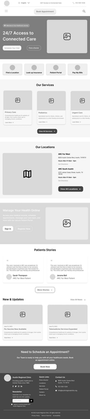
I began with low-fidelity wireframes to define layout, content hierarchy, and user flows. This stage allowed quick iteration before moving into visual design.
Key Priorities in the Wireframes:
-
Ensuring quick access to critical actions such as Find a Doctor and Book Appointment.
-
Creating clear entry points for patients, including Patient Portal, Insurance, and Locations.
-
Designing with a mobile-first approach, so patients could easily schedule visits and access care on any device.

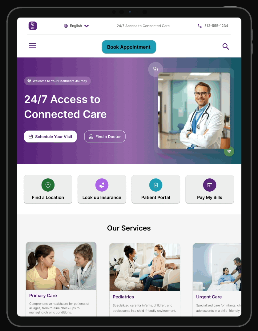
High-Fidelity Designs
With the wireframes and design system in place, I created high-fidelity mockups to show the final look and feel. The focus was on accessibility, consistency across devices, and a clear visual hierarchy.
Desktop

Tablet
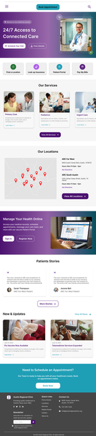
Mobile


Interactive Prototype
To demonstrate the final experience, I created clickable prototypes for desktop, tablet, and mobile. These allow users to explore the redesigned flows and interactions across devices.
Testing & Refinement
I tested the prototype with users to evaluate clarity, navigation, and mobile responsiveness. Feedback led to refinements such as improving the visibility of key actions, adjusting the hamburger menu for smoother interaction, and ensuring the header remains accessible while scrolling.


Developer Handoff
To bridge design and development, I prepared detailed specifications in Figma. The handoff included a responsive grid system, spacing values, and component guidelines to ensure accuracy and consistency during implementation. Developers could easily inspect elements in Dev Mode and access key measurements, typography, and color tokens. In addition, I created a dedicated Design System page with styles, variables, and reusable components to serve as a single source of truth, making collaboration smoother and ensuring scalability across the product.

Final Outcome
The redesign delivers a modern, mobile-first experience with clear access to doctors, services, and resources, supported by a consistent design system across all devices.
Reflection
This project highlighted the importance of accessibility and simplicity, and showed how a solid design system streamlines consistency and developer collaboration.
Next Steps
Future iterations would include expanding the patient portal with appointment booking flows and adding more self-service features to further empower patients.