Design System
The ARC Design System was created to deliver a consistent, scalable, and accessible experience across desktop, tablet, and mobile. Built in Figma, it combines styles for text and color with variables for responsive layouts, theme switching, and efficient updates. The system includes a library of reusable components, such as buttons, headers, heroes, and footers; designed with multiple states and responsive variations to reduce duplication and keep the platform cohesive. Using mapped variables, I also developed light and dark themes, ensuring accessibility, personalization, and brand consistency across all contexts.
Layout Grids: 12-column layout for desktop, 8-column for tablet, and 4-column for mobile

Color: The Austin Regional Clinic color system is designed to convey trust, professionalism, and care while maintaining accessibility standards.


Brand Colors

Neutral Colors


Typography Guidelines: ARC uses the Inter font family for all text elements, providing a clean, professional, and highly readable experience across all devices.


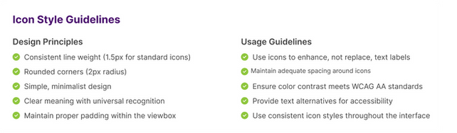
Icons: Consistent icon styles create a cohesive visual language throughout the interface. Our icons are designed to be clear, recognizable, and accessible.
Icon Sizes

Touch Target Guidelines

Status Color Usage

Implementation Guidelines

Icon components includes 105 variants

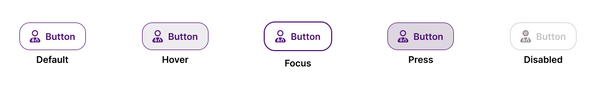
Buttons: Comprehensive guide to ARC's button styles, states, and sizes for consistent user interactions across all devices.
Primary Buttons

Secondary Buttons
Status Buttons

Button Sizes

Components buttons with 45 variants and multiple properties.


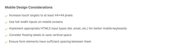
Input Fields: Consistent form elements ensure users can easily input information across desktop and mobile interfaces.
Text Fields

Text Fields with Icons

Search Bar

Textarea Example

Form Layout Example

Mobile Optimized Inputs
Accessibility Guidelines

Cards: Consistent card styles for displaying various types of information throughout the website.
Service Cards

Card Variations - Three Variations for Desktop, Tablet and Mobile


Patient Stories Card

Location Card

Card Design Guidelines


Header, Hero, and Footer Variations


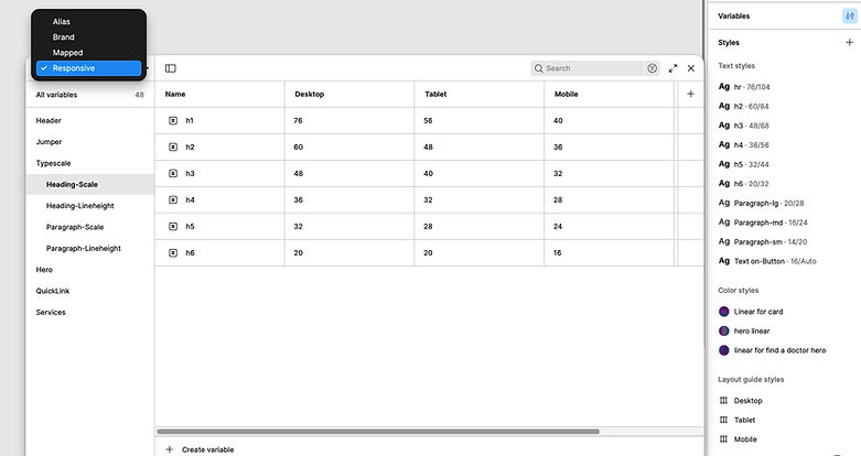
Style Tokens & Variables
For this project, I used both Figma styles and variables, but relied more on variables to manage responsive typography, colors, and layout tokens. Styles supported consistency in text and color, while variables added flexibility for scaling and building light/dark themes.
Responsive typography and layout variables defined for desktop, tablet, and mobile
Mapped color tokens built for light and dark themes to ensure consistency and accessibility.
